1. Experience
Project Phase Overview
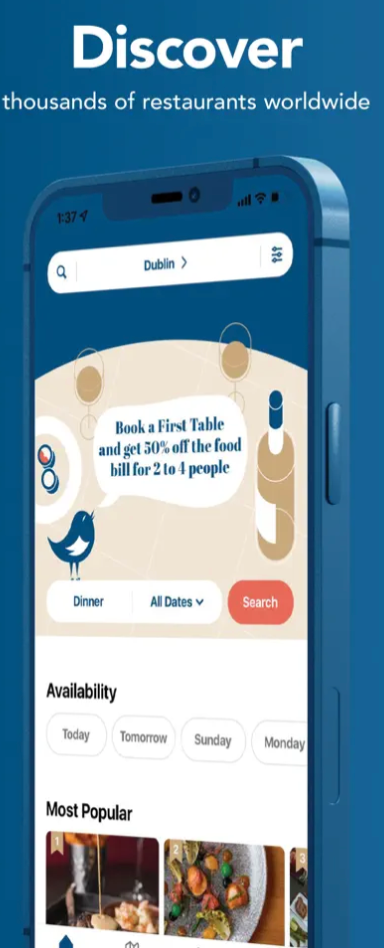
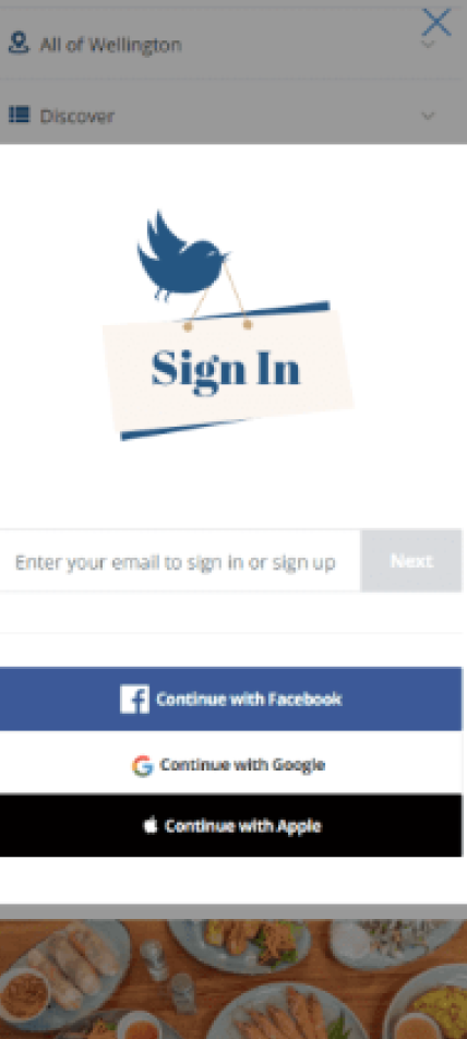
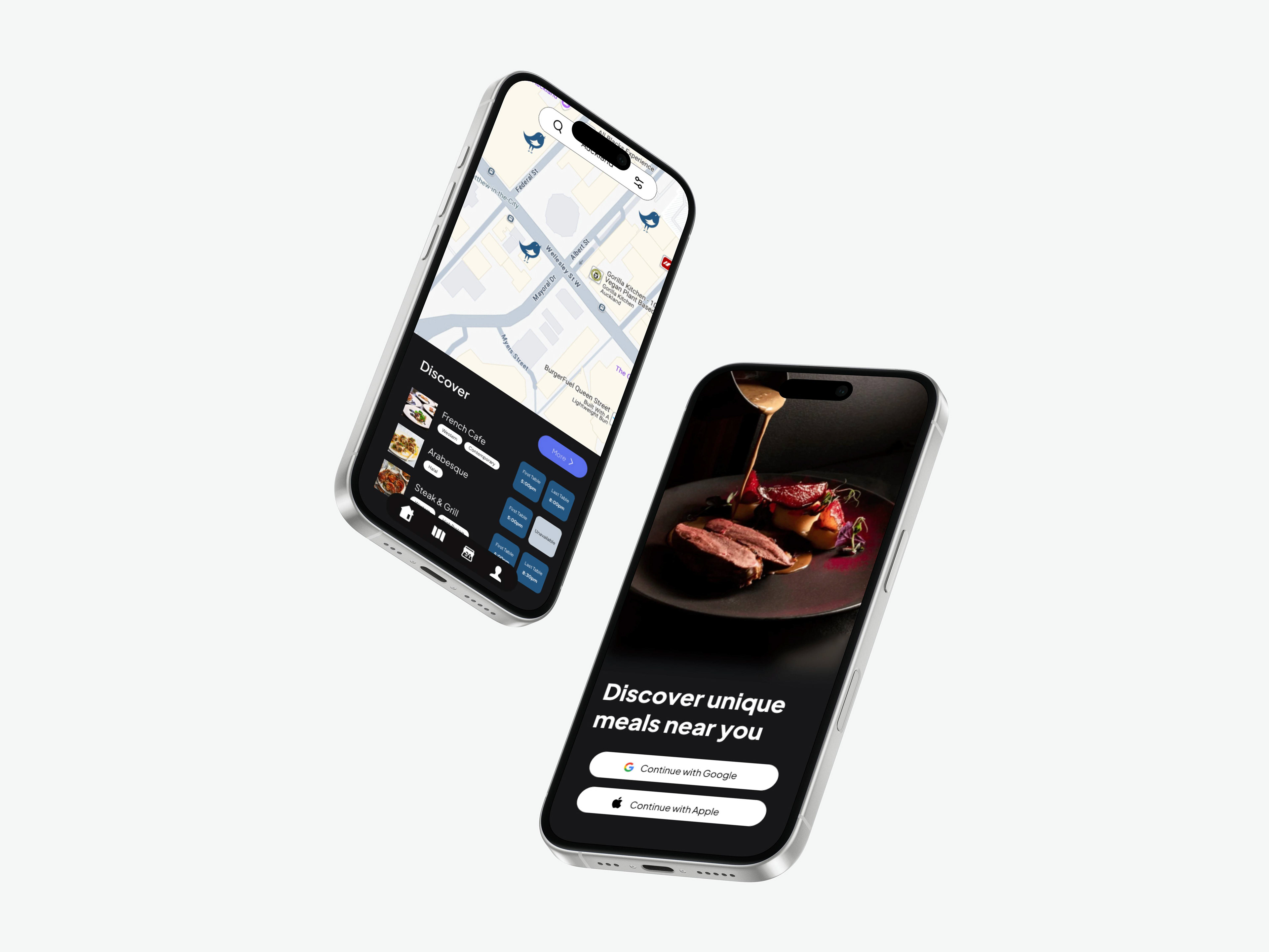
This week, I tackled a redesign of the onboarding process for First Table, a restaurant app that helps users find deals during off-peak dining hours. My goal was to make the onboarding experience more elegant, intuitive, and brand-consistent. Drawing on the typography, UI hierarchy, and brand identity insights from Weeks 7, 8, and 9 (DesignerUp, 2022; Lidwell et al., 2010; Norman, 2013), I wanted to create a refined user journey that guides new users smoothly and builds trust from the first interaction.
I started by analysing the current onboarding flow and identifying pain points: cluttered screens, inconsistent typography, and a lack of clear brand personality. Then, I created wireframes that used modular design principles (inspired by the Bento UI approach from Week 7) and refined typography (Week 9). I tested these wireframes against core usability heuristics and iterated them into high-fidelity mockups that balanced elegance and functionality.
Key objectives for this iteration
- Apply typography hierarchy and modular design to create a clear onboarding flow.
- Use brand-driven UI to build trust and excitement for new users.
- Minimise cognitive load and ensure accessibility in the onboarding process.
Stakeholders involved, if any
As this was a self-directed project, the primary stakeholder was myself—learning to refine onboarding experiences that connect brand identity with user needs.
As this was a self-directed project, the primary stakeholder was myself—learning to refine onboarding experiences that connect brand identity with user needs.
Feelings & First Impressions
At first, I felt inspired by how onboarding can shape a user’s entire impression of a product. But I was also cautious because onboarding has to be frictionless—users don’t want to be overwhelmed. As I tested different flows, I felt more confident about how to integrate the typography and brand insights from past weeks to make the onboarding experience feel polished and inviting.
2. Reflection on Action
Evaluation of Results
What worked well?
Building on the typography hierarchy lessons from Week 7 and the brand-driven UI principles from Weeks 8 and 9 helped me create a clearer, more visually consistent flow. I found that using consistent heading weights, legible body text, and clear visual grouping made the onboarding feel more intentional and user-friendly (Google, n.d.; World Wide Web Consortium, 2018).
What didn’t work?
Initially, I overcomplicated the onboarding with too many steps, while trying to be thorough, I forgot that simplicity is key in early user experiences. I also had to balance elegance with practical information—making sure new users had enough context without feeling overwhelmed (Sweller, 1988).
Initially, I overcomplicated the onboarding with too many steps, while trying to be thorough, I forgot that simplicity is key in early user experiences. I also had to balance elegance with practical information—making sure new users had enough context without feeling overwhelmed (Sweller, 1988).
Response to the experimentation
This week underscored that onboarding is about user trust. It’s not just about telling them what to do—it’s about setting the tone for the app’s brand and how it will support them.
This week underscored that onboarding is about user trust. It’s not just about telling them what to do—it’s about setting the tone for the app’s brand and how it will support them.
Analysis
One insight was that typography and hierarchy directly influence how welcoming and engaging an onboarding flow feels. For example, using larger display type for headlines and calm, minimal body text (as learned in Week 7 and 9) helped create an elegant, clear feel (DesignerUp, 2022; Lidwell et al., 2010).
One insight was that typography and hierarchy directly influence how welcoming and engaging an onboarding flow feels. For example, using larger display type for headlines and calm, minimal body text (as learned in Week 7 and 9) helped create an elegant, clear feel (DesignerUp, 2022; Lidwell et al., 2010).
Another takeaway was the importance of visual rhythm and brand personality (Norman, 2013). Small touches—like animation or visual transitions—can add delight while still respecting user attention and trust (Hassenzahl, 2010).
How did this phase shift my thinking?
I realized that onboarding isn’t just about “explaining” the product—it’s a brand handshake. Every decision—typography, spacing, colour, animation—reinforces how trustworthy and engaging the app feels.
I realized that onboarding isn’t just about “explaining” the product—it’s a brand handshake. Every decision—typography, spacing, colour, animation—reinforces how trustworthy and engaging the app feels.
3. Theory
Connection to Research & Goals
This project deepened my understanding of how cognitive load theory (Sweller, 1988) and information hierarchy (Lidwell et al., 2010) shape user experiences. It also reinforced how trust-building and first impressions are core to digital products (Norman, 2013).
Relevant frameworks and ideas:
Typography & Visual Hierarchy: Building on Week 7, using size, weight, and alignment to create clarity (DesignerUp, 2022; Google, n.d.).
Brand Identity in UI: From Week 8, ensuring brand voice is woven into visual and interaction design (Norman, 2013).
Onboarding Best Practices: Aligning with usability heuristics and best practices to reduce friction (Nielsen, 1994).
Emotional Design: Small interactions and delightful transitions build positive first impressions (Hassenzahl, 2010).
How my goals evolved:
Initially, I saw onboarding as a functional necessity. Now I see it as a strategic touchpoint—an opportunity to set the tone for trust, brand values, and usability from the very start.
Initially, I saw onboarding as a functional necessity. Now I see it as a strategic touchpoint—an opportunity to set the tone for trust, brand values, and usability from the very start.
4. Preparation
Future Directions
Moving forward, I want to test this redesigned onboarding flow with real users to ensure it feels as elegant and accessible in practice as it does in prototypes. I also want to explore how motion design and subtle interactions (like progressive disclosure) can further elevate the experience.
Moving forward, I want to test this redesigned onboarding flow with real users to ensure it feels as elegant and accessible in practice as it does in prototypes. I also want to explore how motion design and subtle interactions (like progressive disclosure) can further elevate the experience.
Next steps:
Validate the onboarding redesign with user testing for clarity and brand alignment.
Research how micro-interactions can add delight without disrupting clarity.
Create a style guide for onboarding flows—typography tokens, spacing, and transitions—for future scalability.
References
DesignerUp. (2022). The ULTIMATE GUIDE to TYPOGRAPHY in UI Design! [Video]. YouTube. https://www.youtube.com/watch?v=xnqdvs4zp2o
Google. (n.d.). Material Design: Typography. https://m3.material.io/styles/typography/overview
Hassenzahl, M. (2010). Experience design: Technology for all the right reasons. Morgan & Claypool.
Lidwell, W., Holden, K., & Butler, J. (2010). Universal principles of design (2nd ed.). Rockport.
Nielsen, J. (1994). Heuristic evaluation. In J. Nielsen & R. L. Mack (Eds.), Usability inspection methods (pp. 25–62). Wiley.
Norman, D. (2013). The design of everyday things (Revised and expanded ed.). Basic Books.
Sweller, J. (1988). Cognitive load during problem solving: Effects on learning. Cognitive Science, 12(2), 257–285. https://doi.org/10.1207/s15516709cog1202_4
World Wide Web Consortium. (2018). Web Content Accessibility Guidelines (WCAG) 2.1. https://www.w3.org/TR/WCAG21/