The challenge
Turner's sells cars, finance and insurance under one roof — but there was no way to get an insurance quote online. The only self-serve form, for finance, ran nine steps; for insurance you had to go into a branch.
My role
A solo, end-to-end project: I ran the research, framed the problem, designed the flow, tested it with users, and delivered the hi-fi desktop and mobile redesign.
Outcome
Splitting a single dense questionnaire into four focused steps cut the inputs on each page from seven to three.
Before
You could see that Turners offered insurance — but to get an actual price you had to go into a branch. The one self-serve form on the site, for finance, ran nine steps.
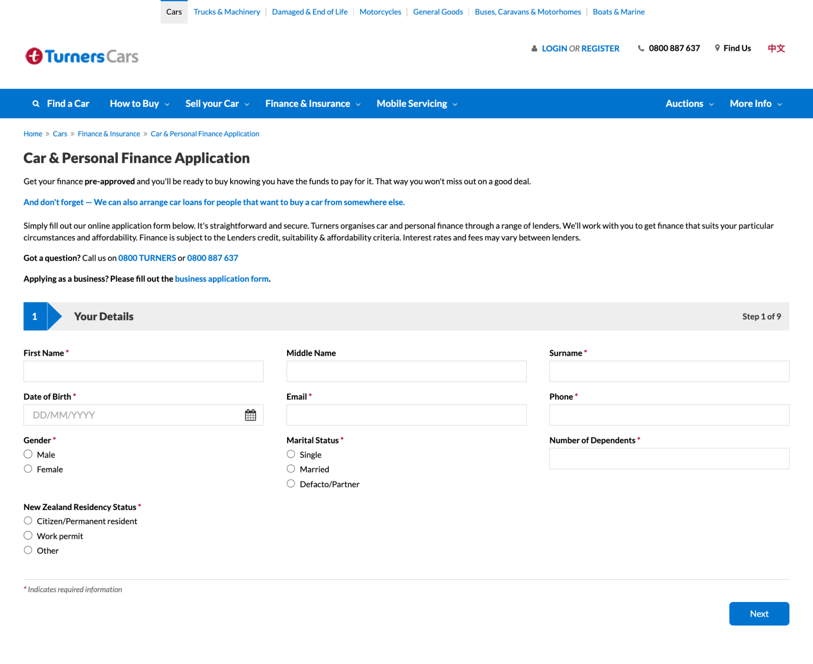
Turners' existing online application — “Step 1 of 9”, a dozen fields deep
No way to quote insurance online.
hover ↻The site could show that cover existed, but getting a price meant a trip to the branch.
The one online form was nine steps.
hover ↻The finance application — the closest thing to an online journey — crams a dozen fields into step one of nine.
So price-shoppers went elsewhere.
hover ↻With every major rival offering an instant online quote, there was little reason to wait around.
Bridge · Competitive analysis
AA, AMI and Tower all let you quote and buy in minutes — the exact self-serve journey Turners was missing.
| Online quote flow | Turners (before) | AA Insurance | AMI | Tower |
|---|---|---|---|---|
| Get a quote online | ✗ | ✓ | ✓ | ✓ |
| Buy a policy online | ✗ | ✓ | ✓ | ✓ |
| Quick, guided steps (not one long form) | ✗ | ✓ | ✓ | ✓ |
| Compare cover side-by-side | ✗ | ✓ | ✓ | ✓ |
| Flags the “most popular” cover | ✗ | ✓ | ✓ | ✓ |
Bridge · Discover
The tell: a shift-working chef who “shops for everything online” only found Turner's insurance while buying a car. People don't shop for it — they stumble into it.
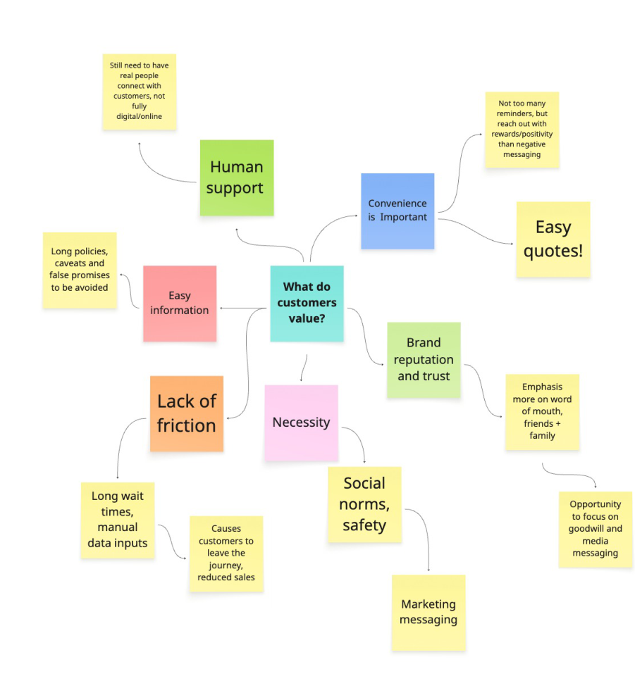
Clustering the interviews into what customers actually value
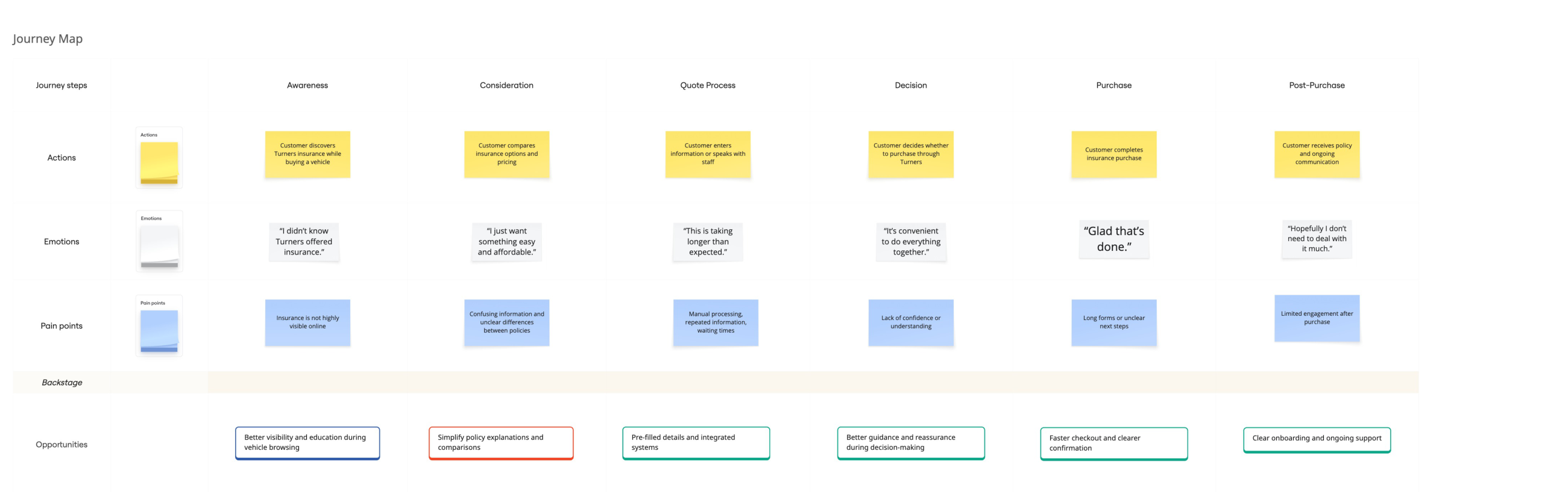
Mapping the journey — friction peaks at the quote and decision stages
Bridge · Define
Everything pointed at the seam between buying a car and insuring it.
User story
As a customer purchasing a vehicle through Turners, I want to quickly and clearly understand my insurance options, so that I can confidently purchase insurance without feeling confused or overwhelmed.
Bridge · Ideate
I generated solutions, voted the strongest to the top, then mapped them on effort versus confidence to decide what to build first.
The “Now” quadrant became the backbone of the build.
Splitting one dense page into four steps — each asking only what it needs — is where the 57% drop came from.
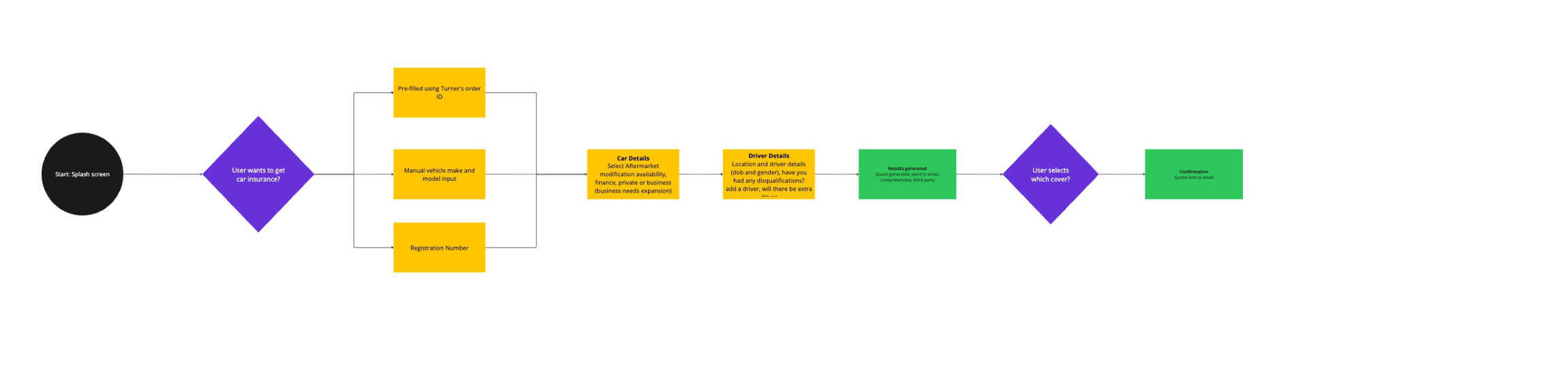
The to-be user flow
The sitemap for the four-step journey
Bridge · Design
Then I wireframed each step before committing to visual design.
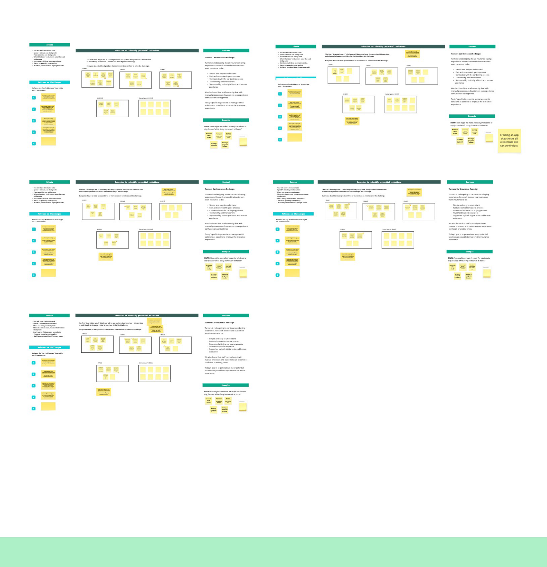
Wireframing each step
Bridge · Test
I rated every issue by severity. Nothing catastrophic — the flow held up; the rest were clarity fixes that each redrew a screen.
None — the core flow held up
Severity ratings — nothing catastrophic, every issue a clarity fix
After
Four calm steps, each answering something a tester got stuck on.
Solution 01
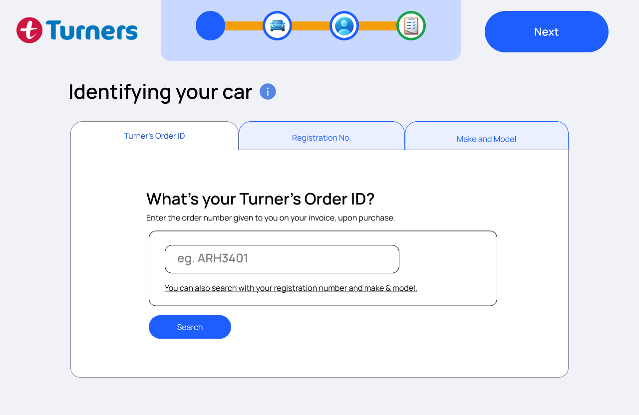
Testers weren't sure they had to be a Turner's customer, so the Order ID became optional, beside registration and make-and-model.
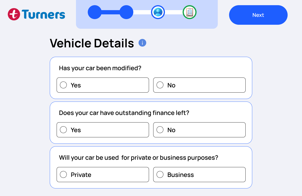
Solution 02
“Is the progress bar even moving?” became a numbered stepper showing exactly where you are and what's left.
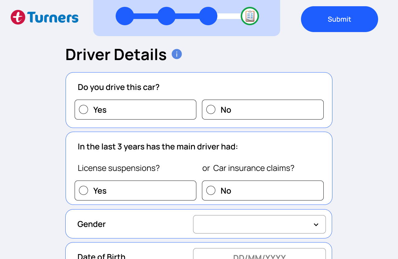
Solution 03
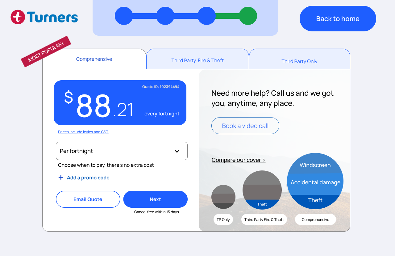
The quote makes “every fortnight” explicit, flags the most popular cover, and adds the side-by-side comparison testers asked for — on desktop and mobile.
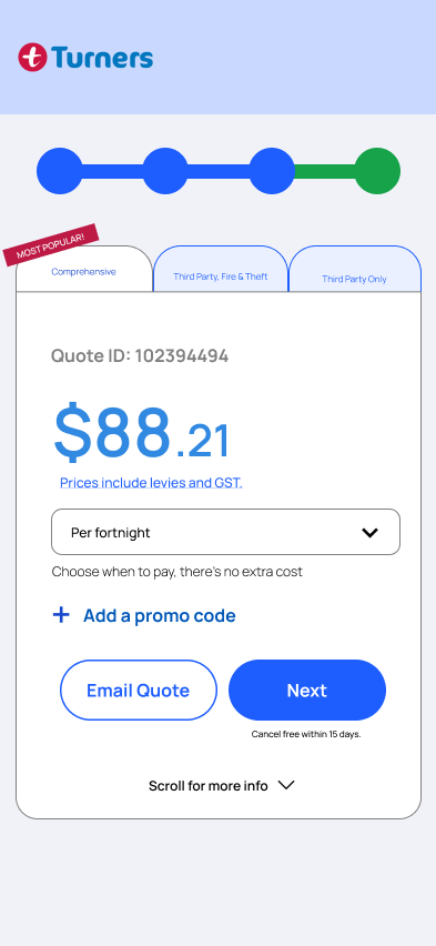
…and on mobile
Solution 04
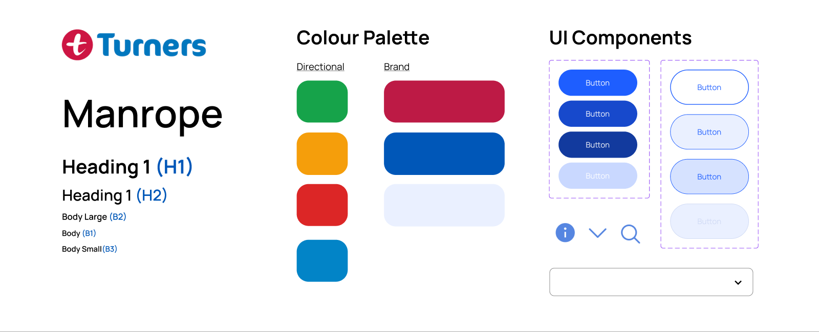
Manrope, the Turner's palette, and components with their states — inside the brand guidelines the stakeholder flagged.
Reflection
SEE NEXT