The challenge
Retirement villages are full of good spaces and events, but moving into one still leaves many residents lonely. And most wellbeing apps assume a level of digital confidence a lot of older people just don't have.
The response
So I made two things that work together: an app for people comfortable on a phone, and a physical card toolkit for the shared table. That way the format itself doesn't leave anyone out.
The outcome
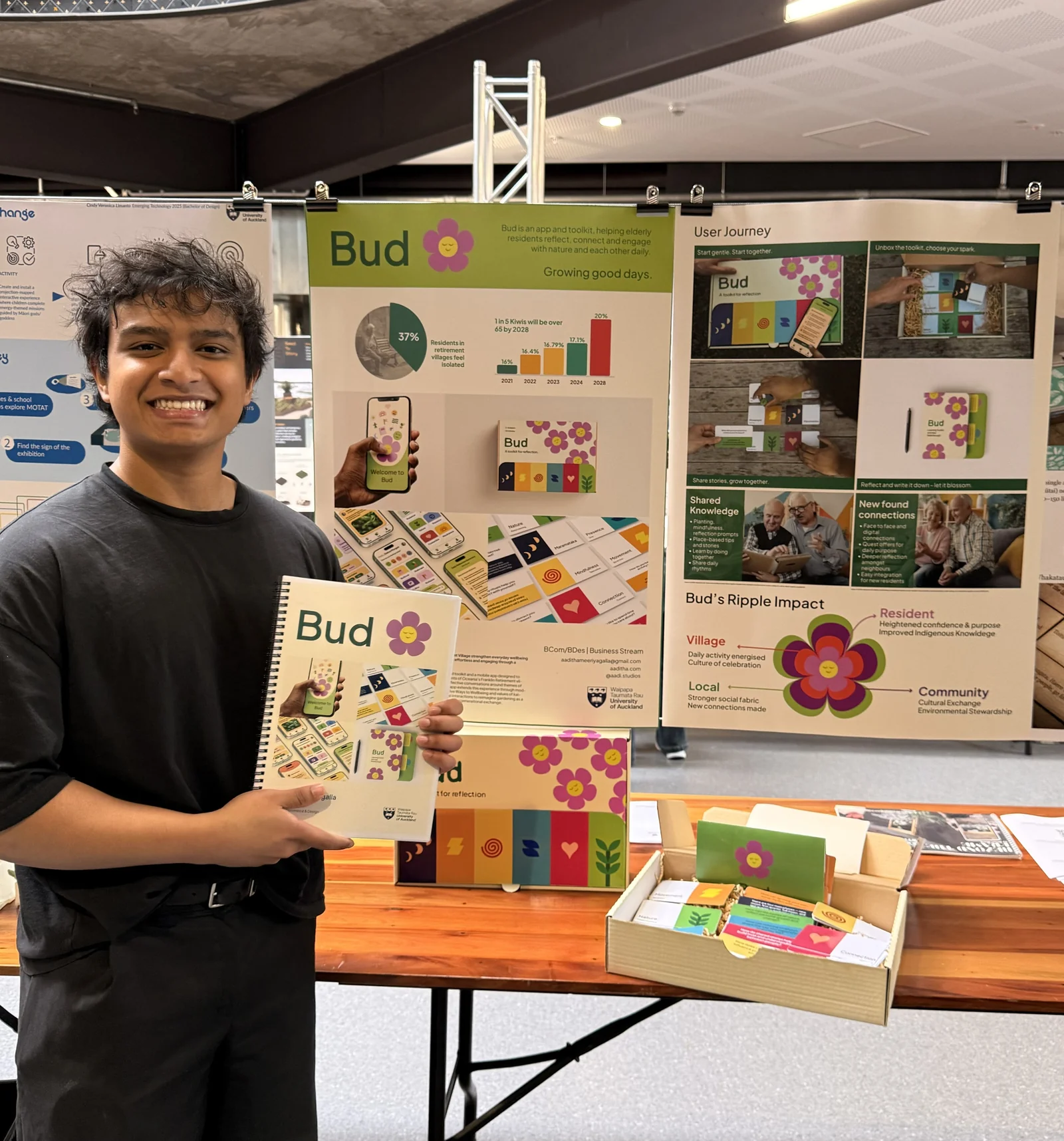
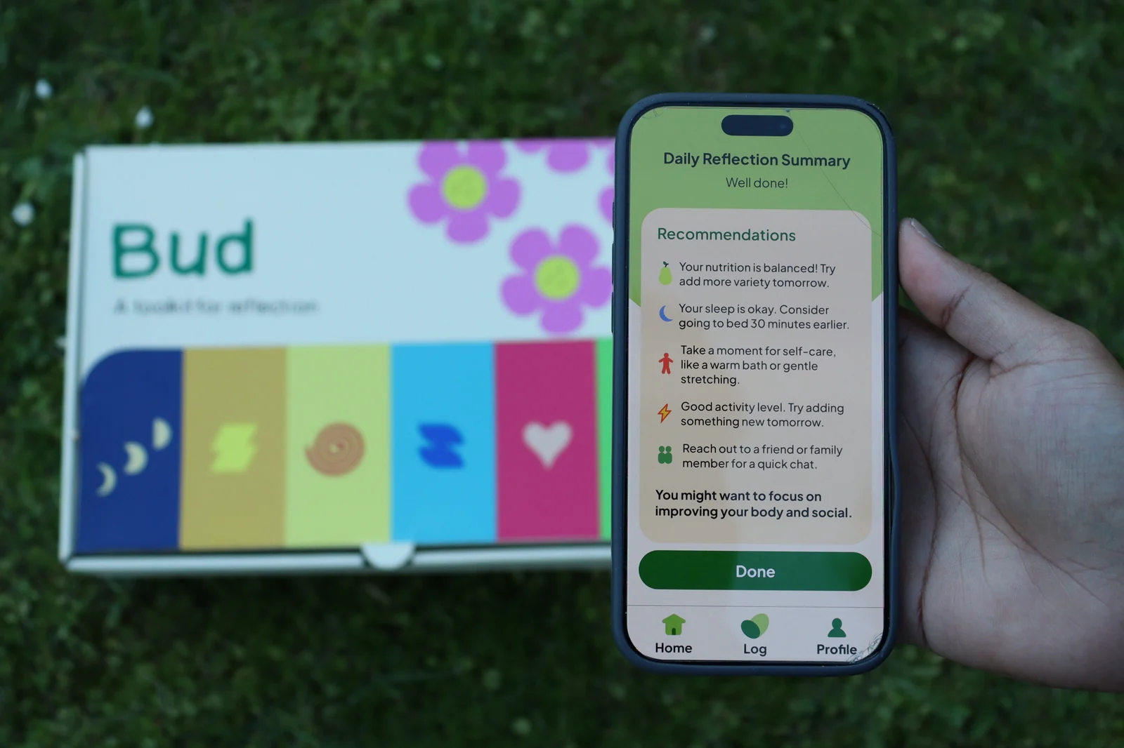
Bud meets residents wherever their confidence sits. The app turns wellbeing into five small, friendly rituals, and the toolkit brings that same reflection to a shared table with cards anyone can pick up. Below is the finished product, then the story of how it got there.
The app · Guided tour
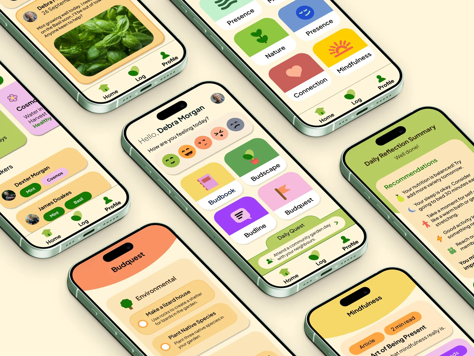
Every module maps to the Five Ways to Wellbeing, and every screen was tuned for large tap targets, one clear action, and plain language. Scroll to walk through them.
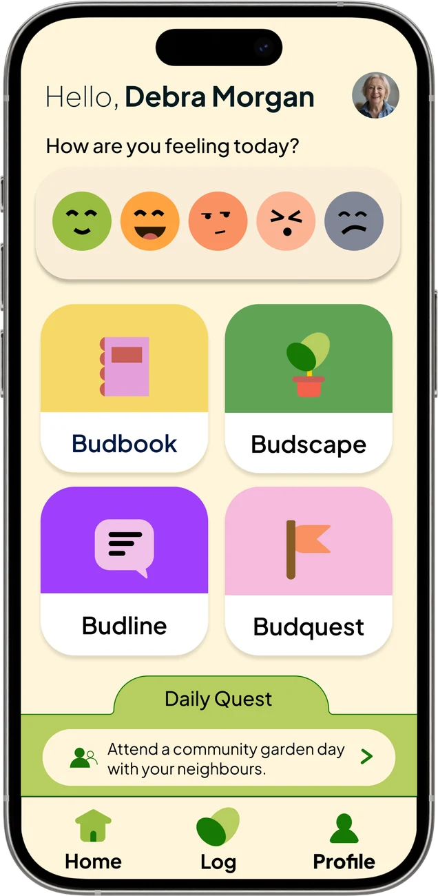
Bud opens with one easy question: how are you feeling today? A row of big mood faces makes the Daily Log a two-second habit, and a single Daily Quest points to the next small step.
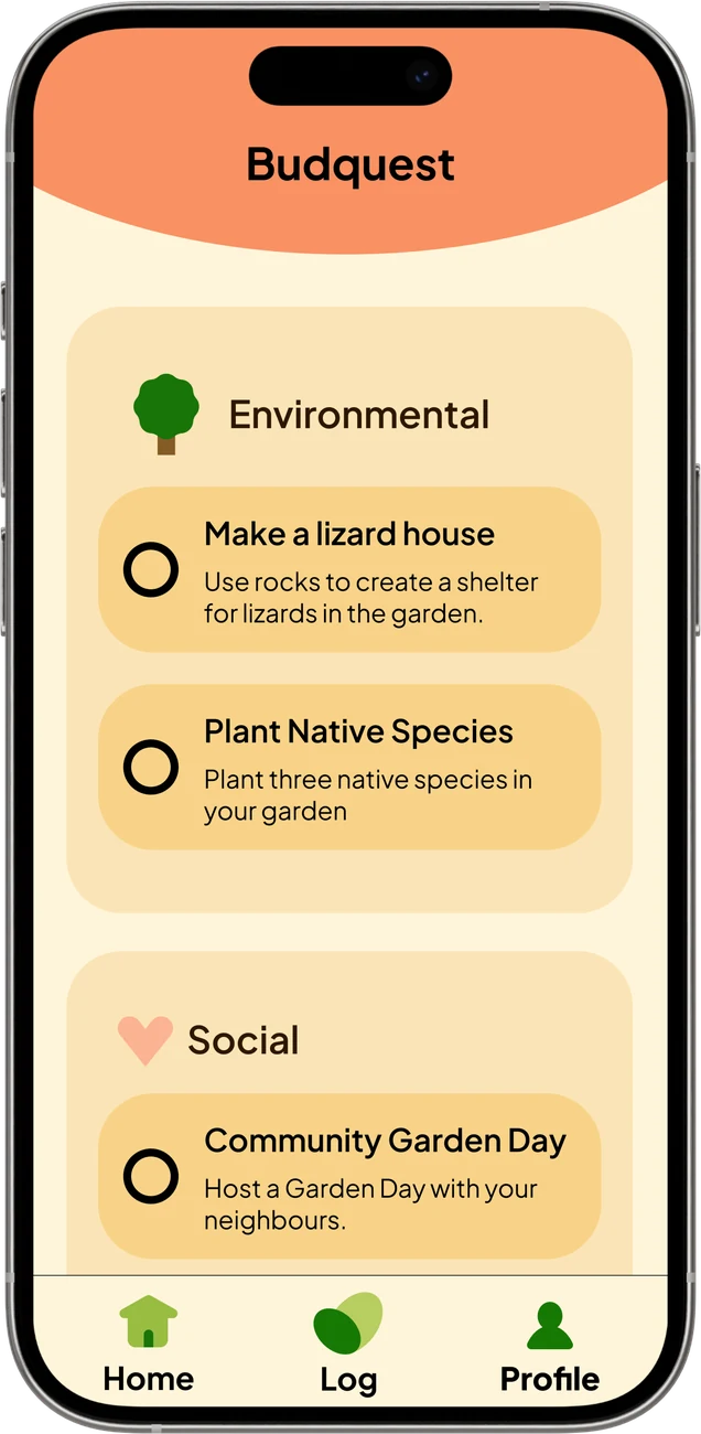
Budquest turns wellbeing into small missions: plant native species, build a lizard house, host a community garden day. They're split into environmental and social, so there's always a low-effort reason to step outside.
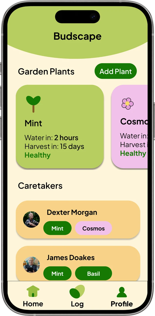
Residents log real plants, track watering and harvests, and add caretakers. Because the garden keeps growing, Budscape avoids the usual drop-off after one-off events. There's always something waiting.
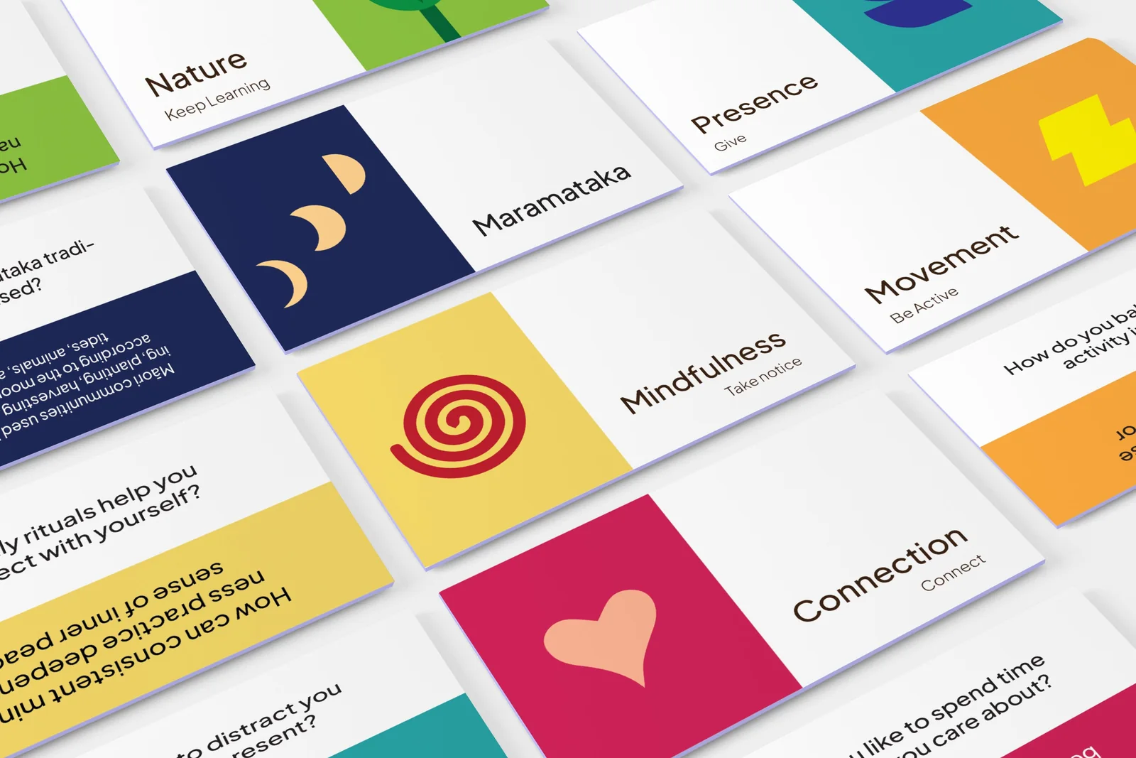
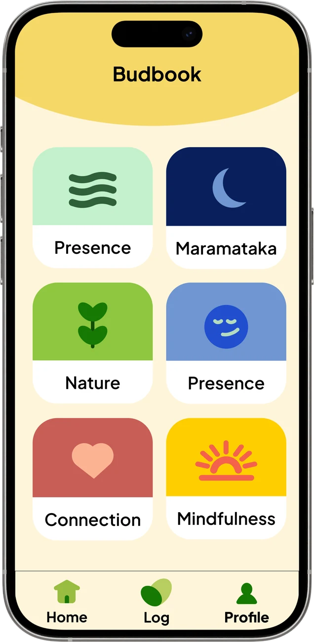
Short reads on presence, movement and connection, plus a Maramataka module that ties reflection to the lunar calendar and local flora instead of generic wellness tips.
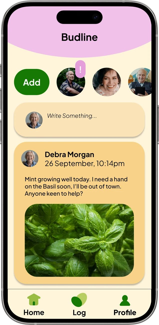
Budline is a soft social layer. Residents post a photo of the basil that's ready, ask for a hand, and organise together. Small posts and real connection, without an algorithm sorting any of it.
01 · Discover · How I got here
The research in my proposal made the stakes clear. Aotearoa is ageing, and moving into a new environment often makes loneliness worse.
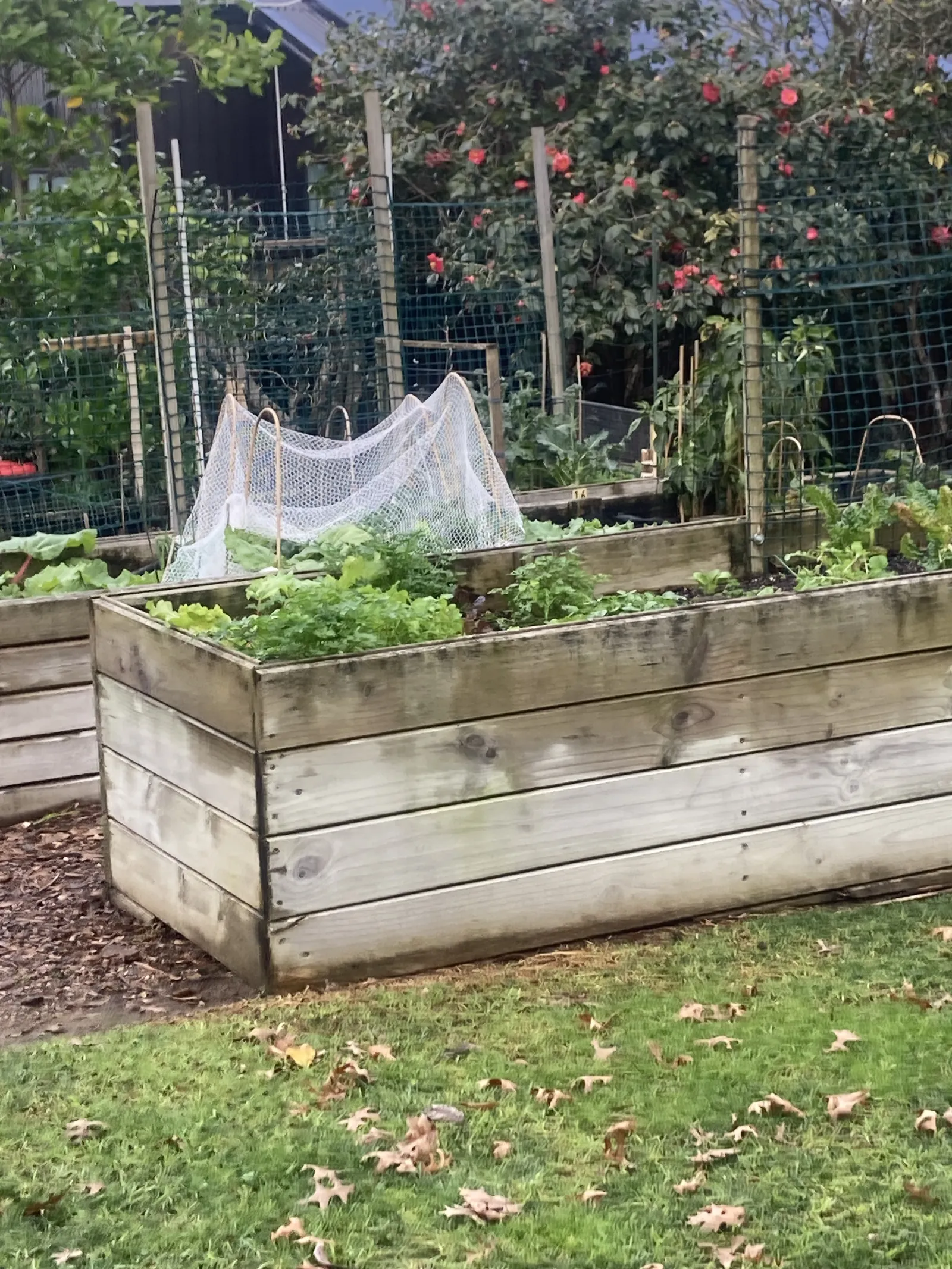
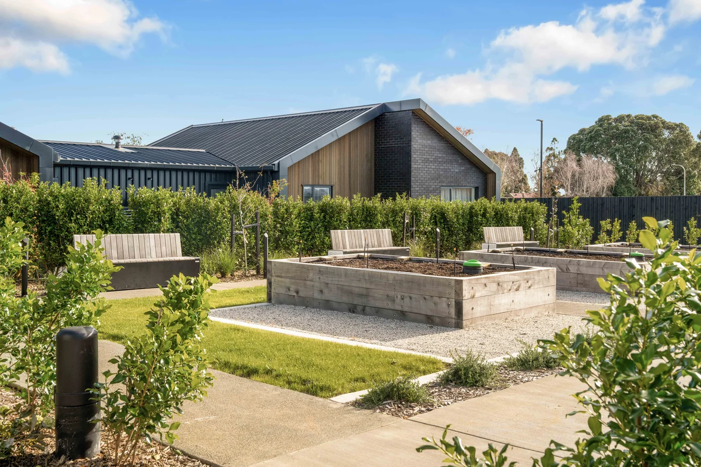
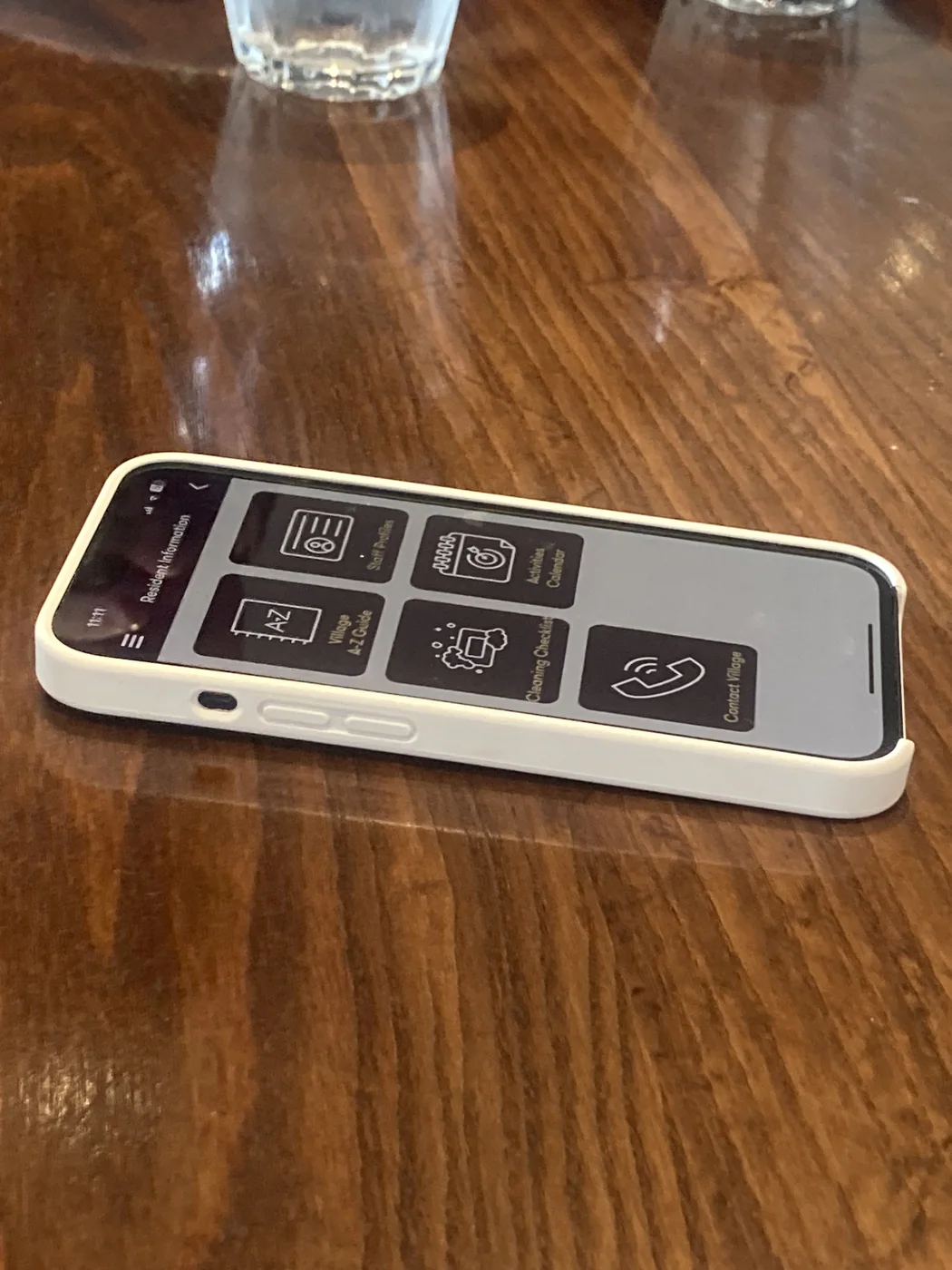
A field trip to Oceania's Meadowbank village grounded the research. Two things stuck. There was already plenty of gardening infrastructure, so a nature-led idea was feasible. And walking through their existing app showed exactly how much large icons, big text and simple flows matter for this audience.
01 / 04 · Field trip
Existing gardening infrastructure at Oceania's Meadowbank village. Proof a nature-led idea was feasible here.
02 / 04 · The site
Raised beds and shared paths at Oceania's Franklin village, the specific community Bud was designed to serve.
03 / 04 · Accessibility
Walking through the existing resident app made the rules obvious: large icons, big text, and one clear action per screen.
04 / 04 · The gap
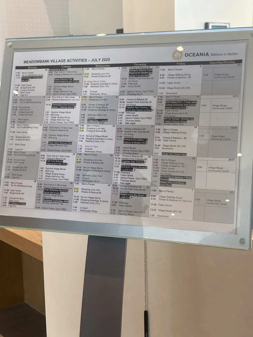
The village activities calendar has plenty going on, but it's static and easy to lose track of week to week.
Residents could already engage sustainably through the nature beds, the app, and a cafeteria timetable. Nothing pulled those pieces into one place.
The printed schedule was hard to read and the app felt administrative. It met accessibility needs, but it wasn't something new residents would want to open.
Oceania take it seriously, with plant beds at Meadowbank and new greenhouses at Franklin. That was a clear opportunity space for a nature-led solution.
02 · Define · Who, and what
I built personas from the research so every decision had a face to answer to. One of them, Debra, later became the friendly name on the app's home screen.
“I want to keep learning and trying new things.”
“I'm always ready to help out!”
“I want tech that keeps me close to my family.”
The problem, framed
How might we help elderly residents strengthen everyday wellbeing by making reflection, connection and nature feel effortless, through a hybrid of a digital app and a physical toolkit?
Defining the scope meant killing some darlings. Each cut came from partner feedback or a hard constraint, and made Bud more usable without making it less ambitious.
The original concept leaned on game mechanics and scores.
Kept gardening as the social hook; dropped the game framing.
A single app to do everything.
A tactile card kit alongside the app.
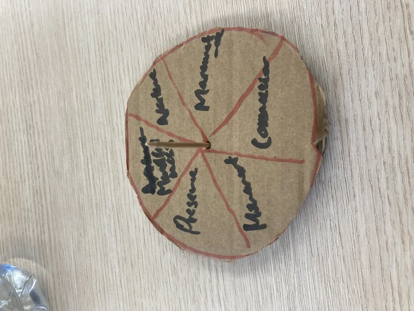
A wheel to choose a reflection theme.
Pick a card, start a conversation.
03 · Develop · Making it real
Every visual decision was made with the final user and accessibility in mind: sans-serif type for legibility, a minimum 16-point size, icons always paired with labels, and a low-chroma palette that reduces visual fatigue while meeting WCAG contrast.


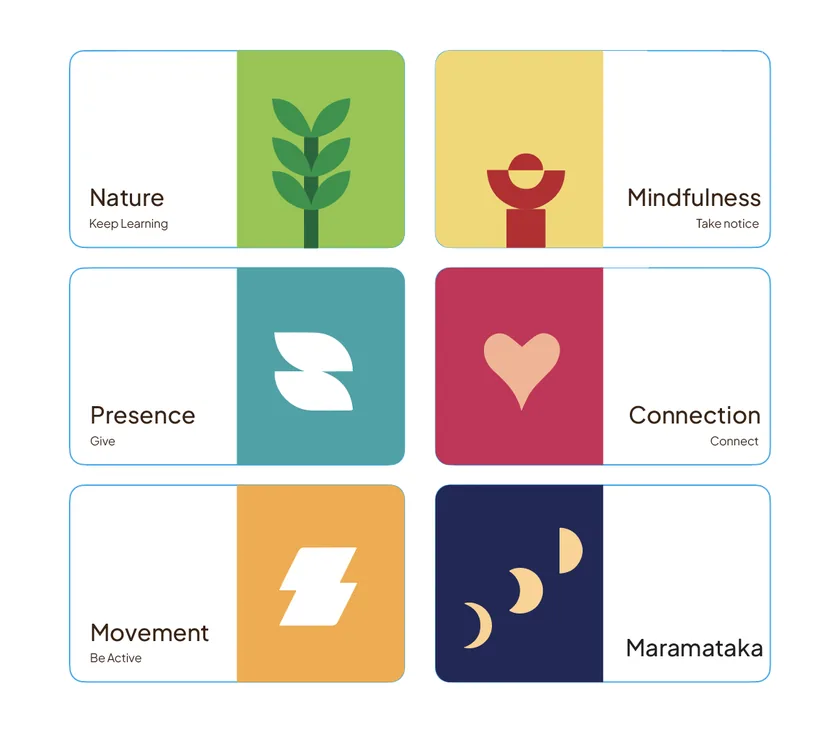
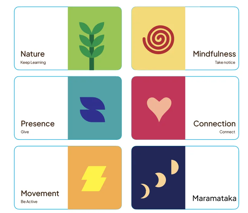
Plump, distinct iconography. Friendly, always labelled, and yours to play with.
With a fixed timeline, I plotted every feature on effort versus confidence. The “Now” quadrant became the backbone of the build; the rest waited.
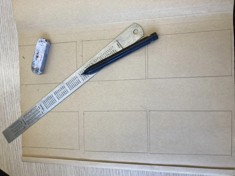
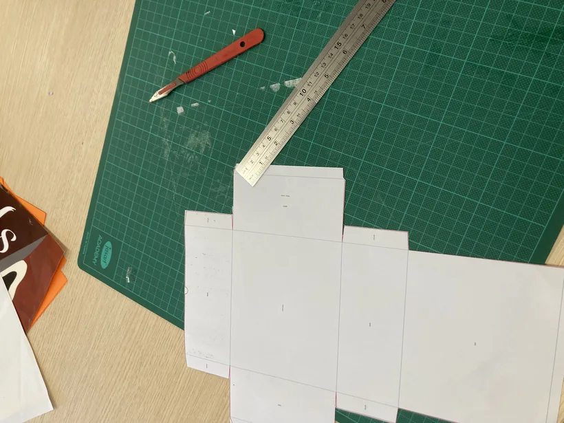
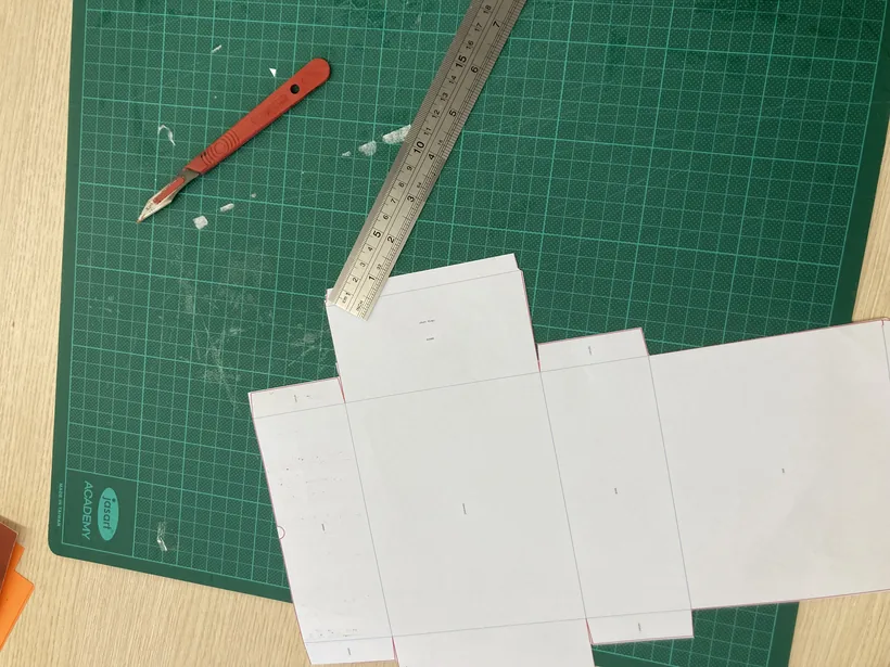
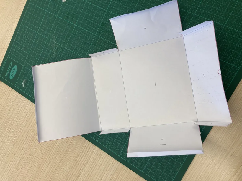
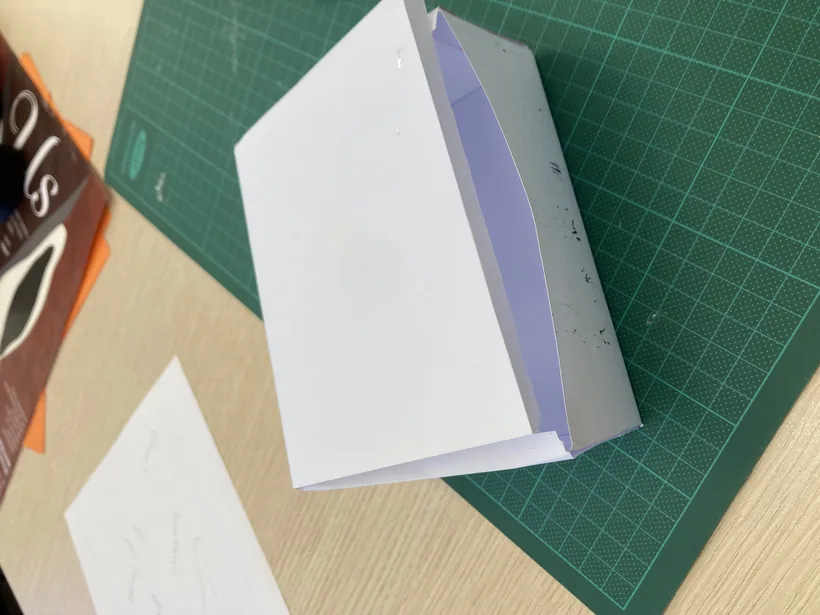
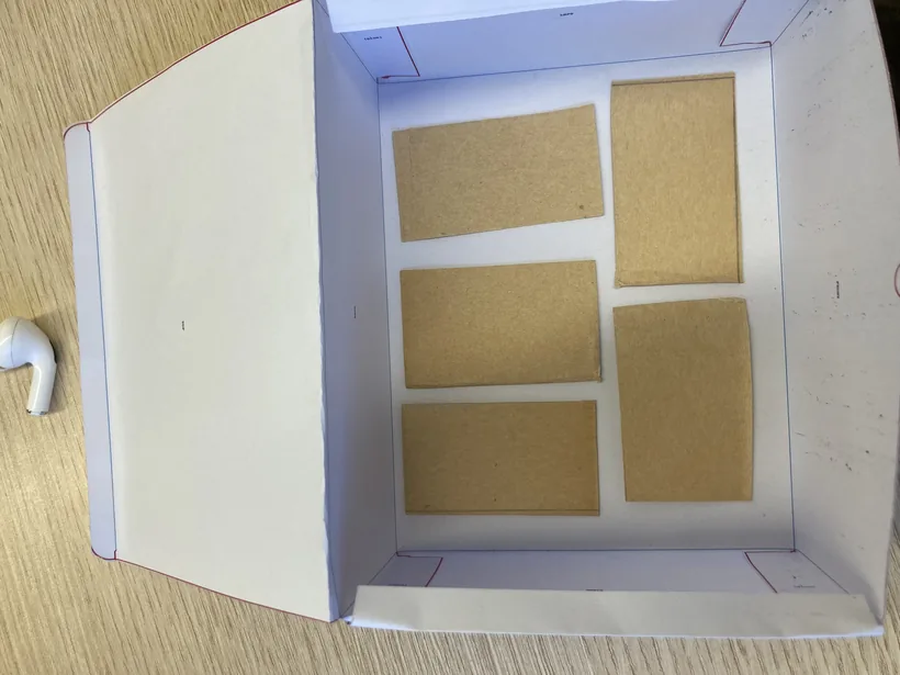
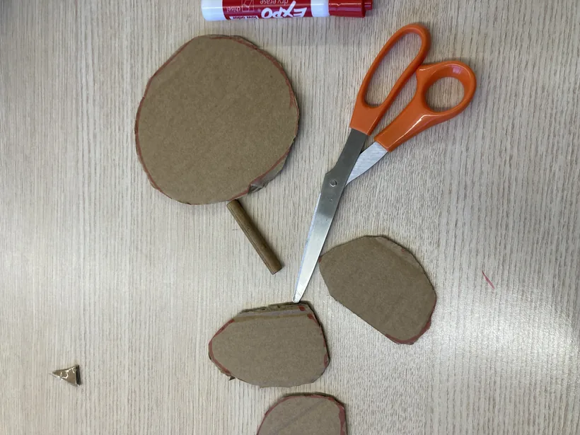
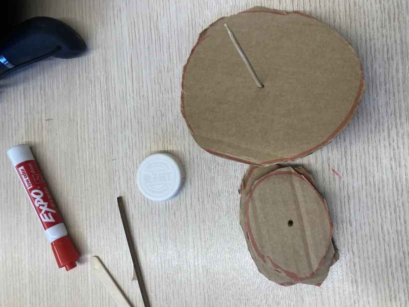
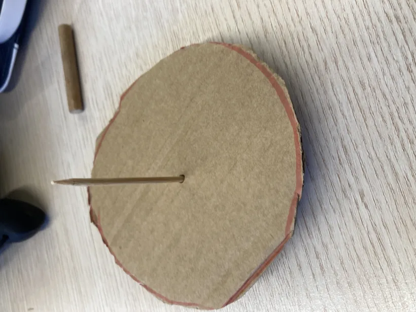
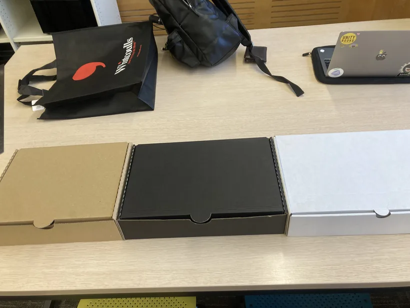
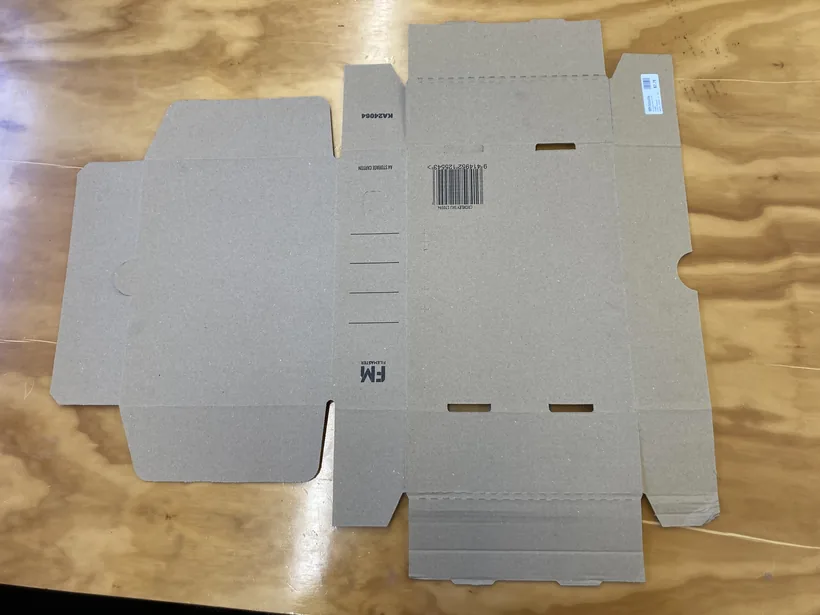
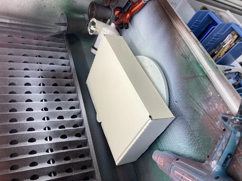
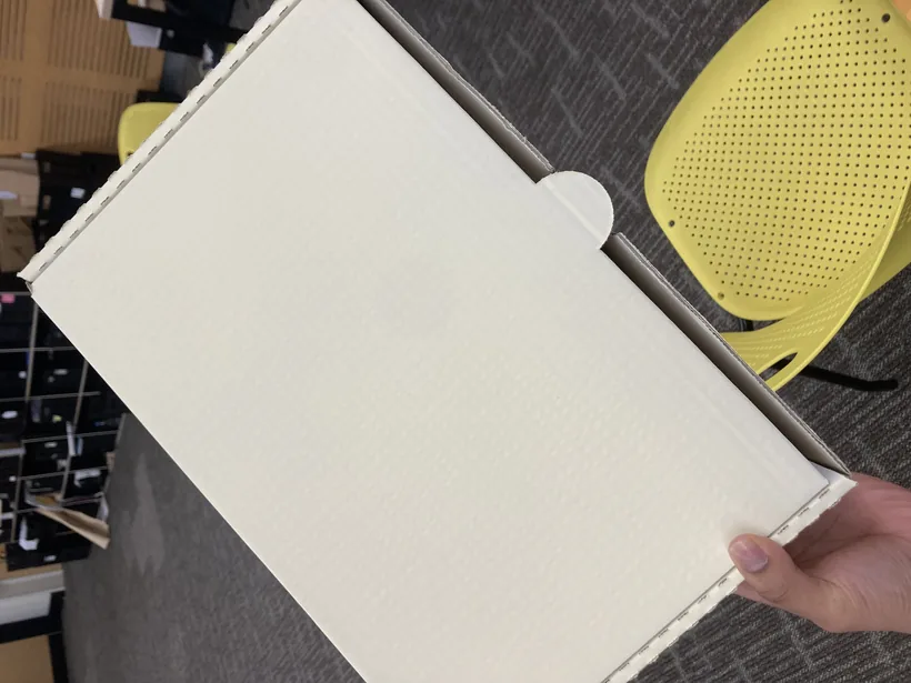
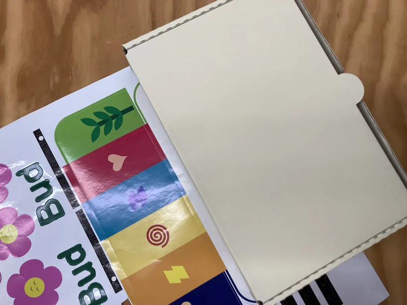
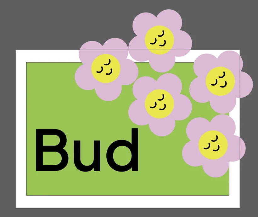
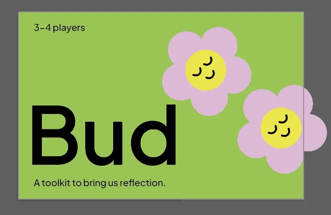
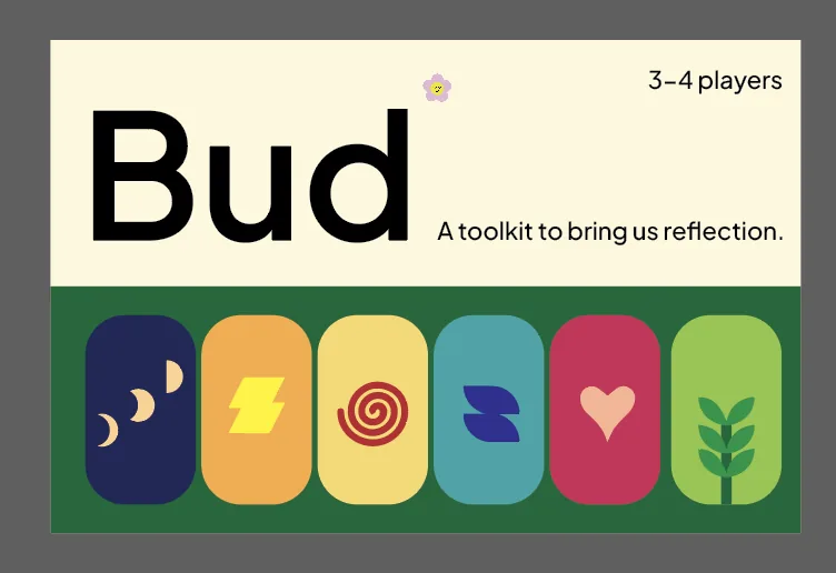
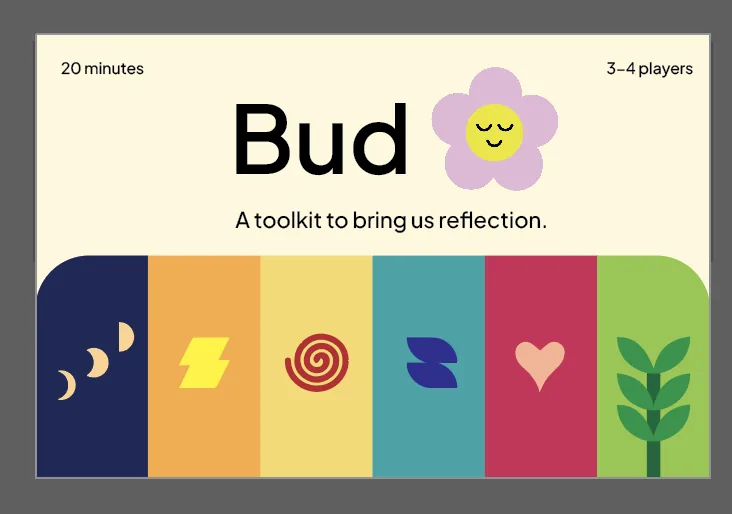
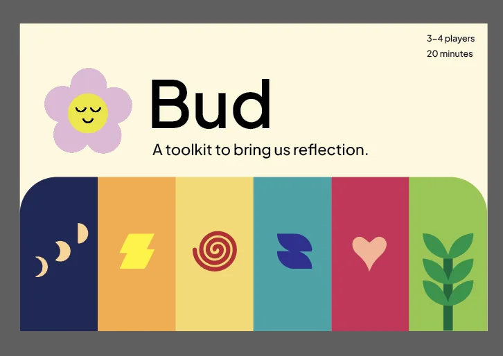
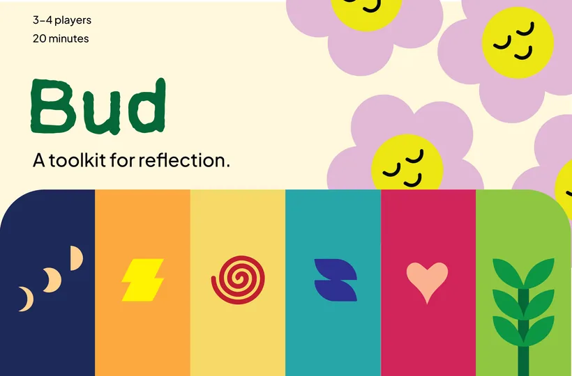
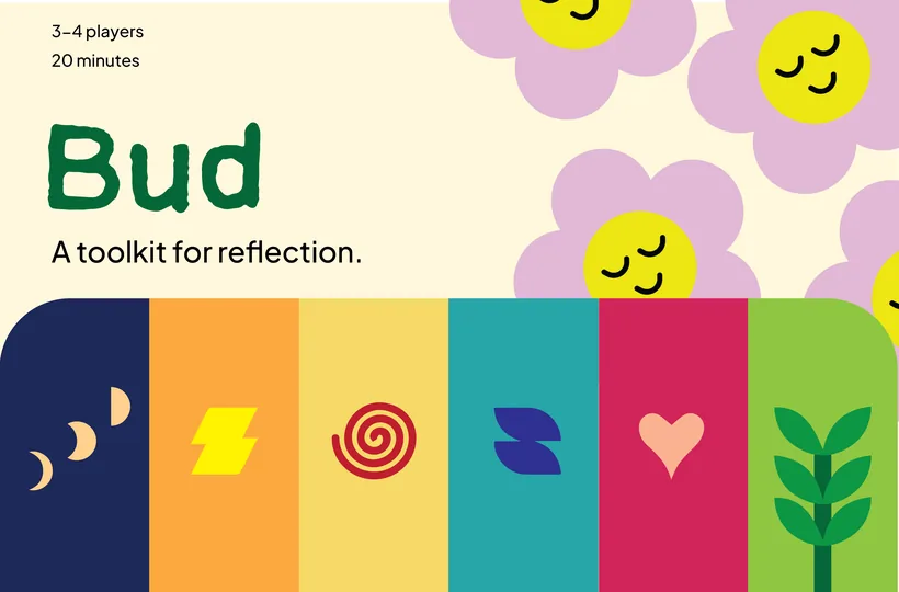
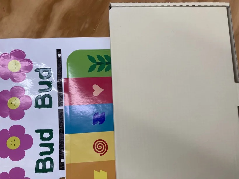
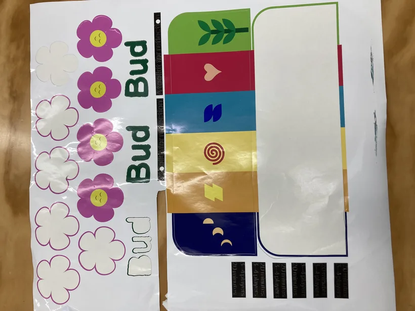
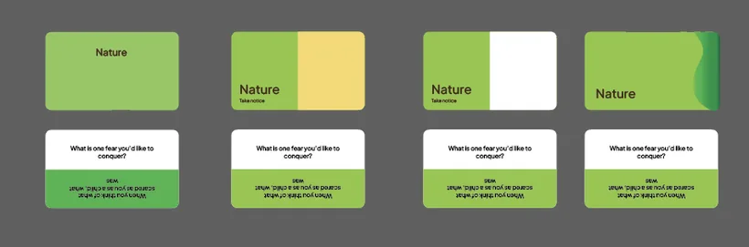
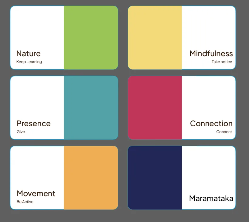
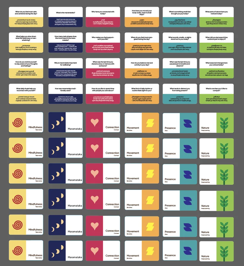
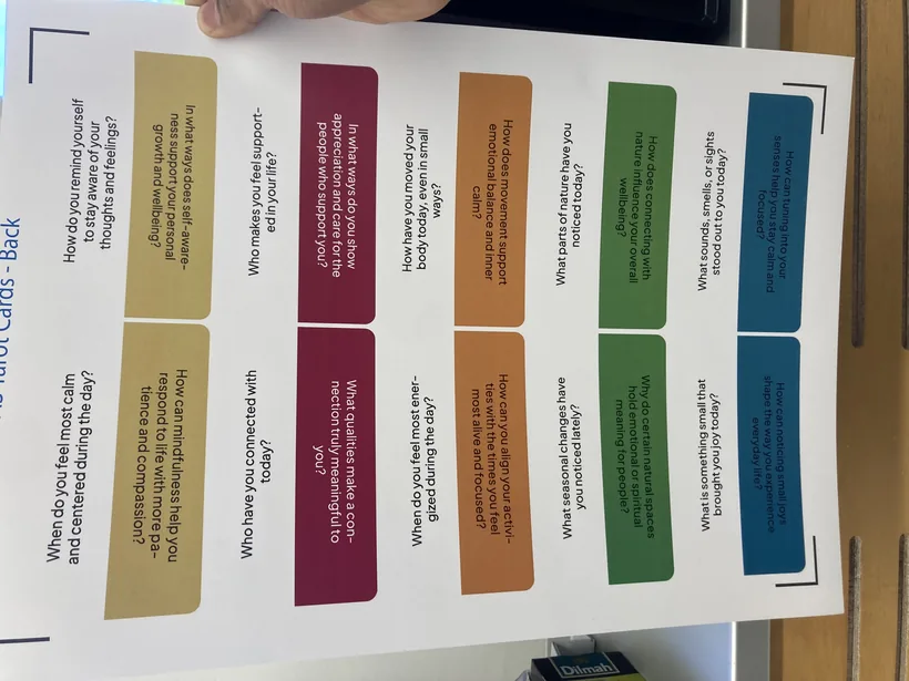
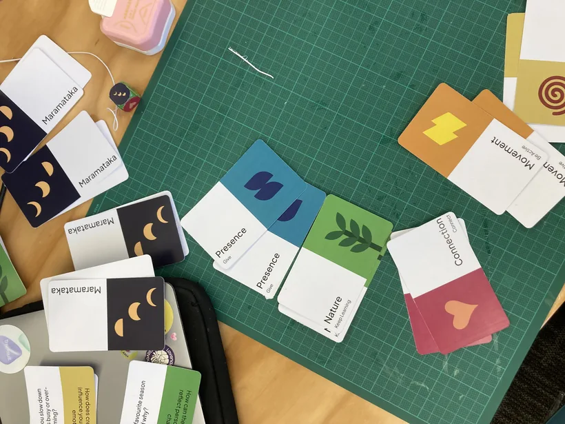
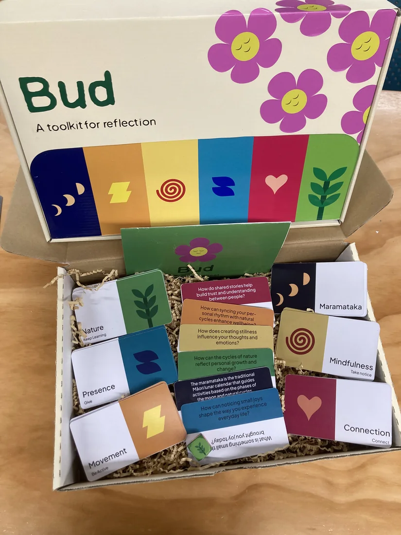
I paper-prototyped first, sizing the cards against the exact box I was targeting, then bought that box for the final build. I designed the branding in Adobe Illustrator, printed and cut the stickers on a Roland BN-20 vinyl cutter, and cut the cards on a Cricut from a ready-made template. Roughest ideas on the left, finished on the right.
The hardest call
A tutor challenged me to try a coded prototype, so I spent two intense weeks learning React Native, TypeScript and Tailwind and shipped a skeletal version of Bud. I was proud of the engineering, but honestly disappointed in how it looked.
After talking it through with my lecturer, I made the mature call and pivoted back to Figma, where my product-design skills could give residents the calm, polished experience they deserved. (One feature, a camera-based plant scanner called Budscan, also got cut after a stubborn permissions bug, and the app was more focused for it.)
I ran moderated think-aloud sessions with five participants, coding every response as an obstacle, a positive, or something to improve. All five completed all four core tasks (logging in, completing a Log, finishing a Budquest and logging a plant) with no hard blocks.
The feedback was almost entirely about the visuals, not the concept. So button labels became verb-first, each screen got one clear action, corners were softened, and type weight and contrast went up.
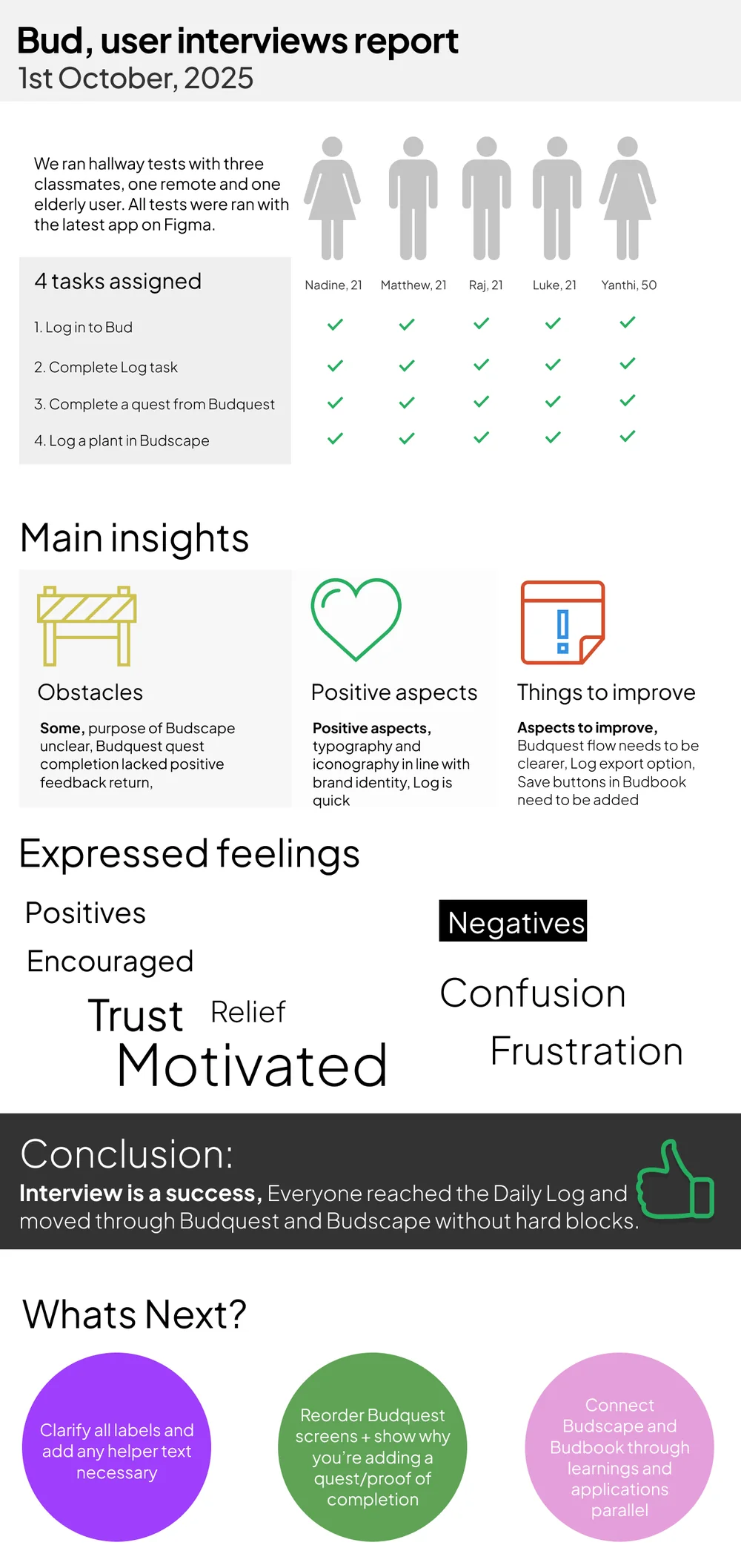
The usability report: 5 participants, 4 tasks, 100% completion, and a clear list of clarity fixes.
Designing under a Te Tiriti lens
As a student designer in Aotearoa, I worked to a Te Tiriti lens throughout, leading with the values of whānau, kaitiakitanga and mahi tahi. In practice that meant one specific, honest choice. Instead of a vague "Indigenous knowledge" feature, I built a focused Maramataka module that ties reflection to the Māori lunar calendar and local flora.
The toolkit is designed as scaffolding. It supports conversation and storytelling led by mana whenua, rather than curating or claiming those stories itself. Where partnership wasn't secured yet, the design falls back to universal wellbeing patterns, with a documented intention to collaborate, and never tokenistic "Māori-ish" placeholder content.
04 · Deliver · The physical toolkit
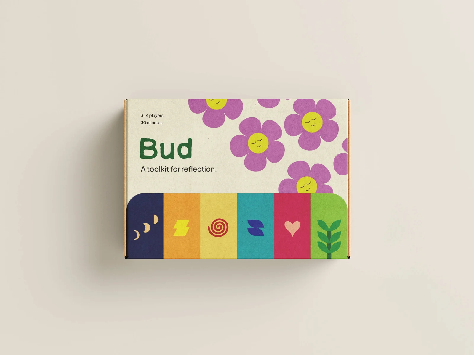
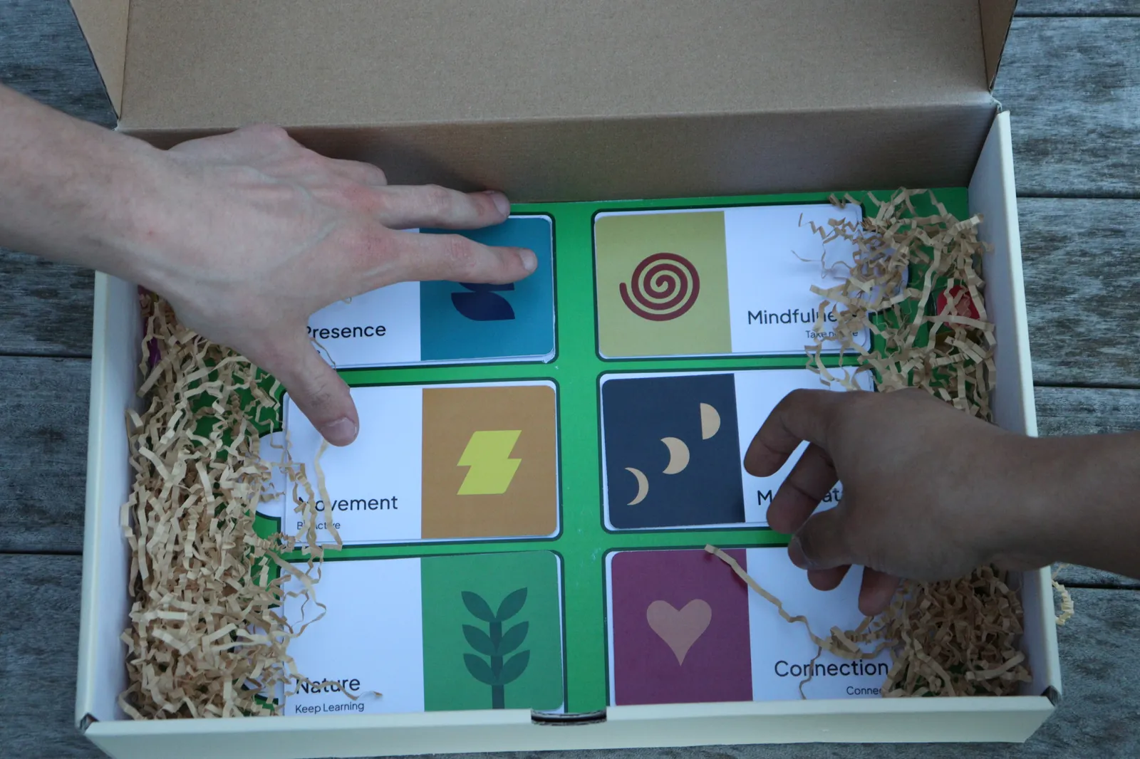
Where the app is personal, the toolkit is social. A 24-card reflection deck, sorted into six themes, sits in a hand-finished box made for communal lounges, so a group can draw a card and start a conversation without a phone.
Mapping the experience from a nervous first day to becoming the person who welcomes the next new arrival.
A resident arrives, timid and unsure of a new place.
They learn about Bud, and chat with staff and neighbours.
Garden chats turn into an organised group reflection.
They use Bud to welcome new residents, and finally belong.
Reflection
Bud was the most ambitious thing I've made: a brand, an app, and a physical product, for a real client and a genuinely vulnerable audience. Three lessons will stay with me.
I see Bud as a living project. With continued dialogue with residents, staff and kaumātua, the app and toolkit could grow to feel less like a capstone and more like a companion, one that helps a village belong.
See next