Lead Designer & Developer
Processing, Javascript
2023
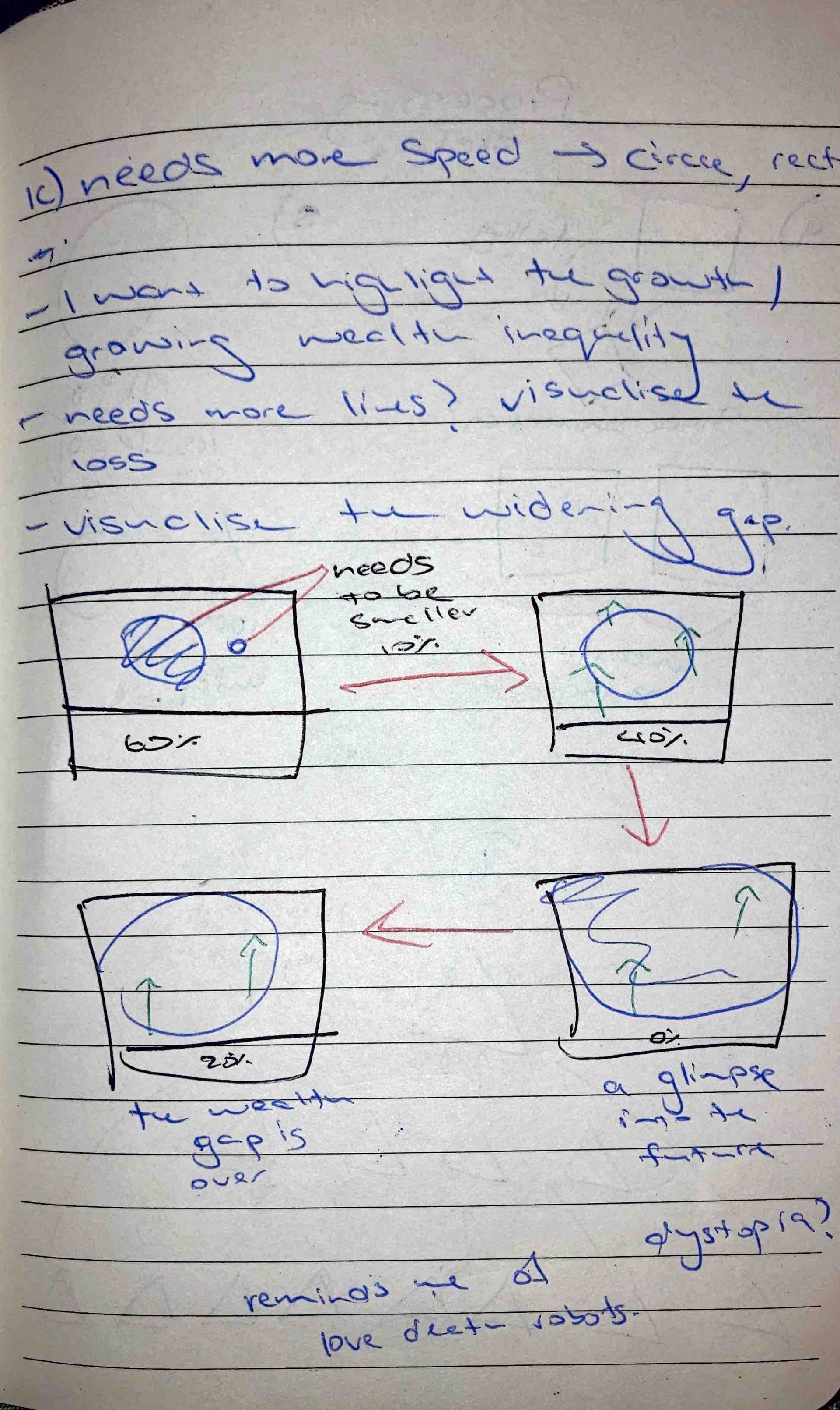
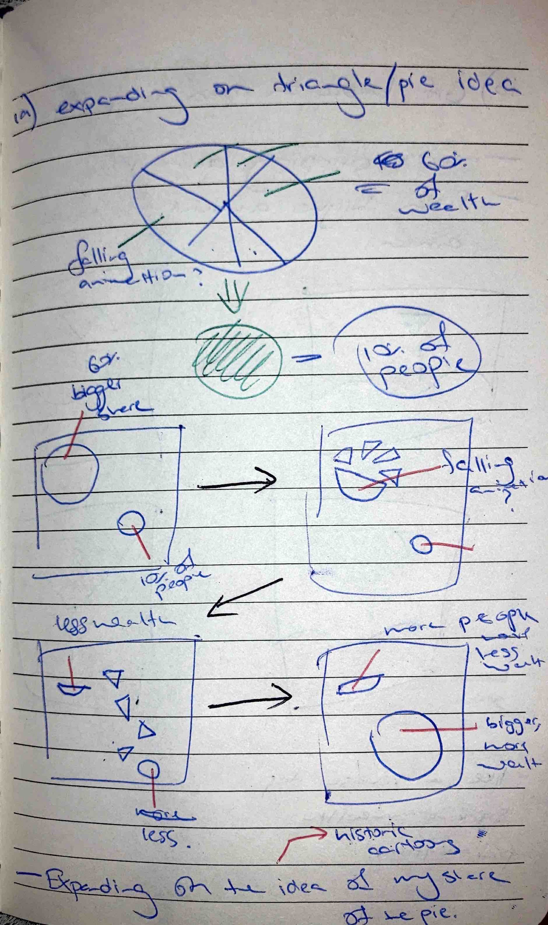
By utilising Processing, I designed a GIF illustrating New Zealand’s widening wealth gap using simple geometric shapes. Inspired by the statistic that the wealthiest 10% own nearly 60% of all assets, the animation features a shrinking rectangle, an expanding circle, and radiating lines to symbolise economic disparity.
As the GIF progresses, the growing circle (representing the wealthy 10%) gradually consumes the shrinking rectangle (the remaining 40% of assets), with lines depicting the slow erosion of wealth. In the final stage, the circle engulfs the canvas, representing a future where inequality dominates.
Objective
How might we visually communicate New Zealand’s widening wealth inequality in a way that simplifies complex data and engages audiences through motion and design?
Research and Ideation
I began by sourcing and validating my statistic. An article according to the Guardian states that "The data show that New Zealand’s wealthiest 1% of adults – around 38,000 people – have $141bn in trusts. Another 150,000 or so people, rounding out the rest of the wealthiest 5%, have trusts worth a further $122bn."
The Guardian’s data, while reliable and derived from sources such as the IRD, NBR rich list, and the Household Economic Survey, had limitations - particularly around non-participation from wealthier households. Despite this, I chose it because of its strong cultural relevance and urgency in the New Zealand context.
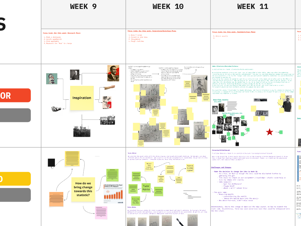
In my ideation, I explored how shapes and motion could metaphorically represent wealth distribution. I sketched storyboard options that featured expanding circles, diminishing rectangles, and directional lines—symbols of imbalance and loss.
Implementation
I translated my sketches into Processing, experimenting with geometric primitives. Early prototypes focused on animating a circle and rectangle to represent the wealthiest 10% versus the rest of society. Core themes implemented implemented:
Circle expansion rate (representing asset concentration).
Rectangle shrinkage (representing the erosion of middle and lower-class wealth).
Line animations (representing increas leakage of wealth).
Prototyping was essential, as my limited coding background meant I had to test small components, refine them, and then integrate into a cohesive sequence.
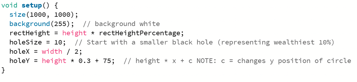
Initial setup of circle of 10 percent, set to expand.
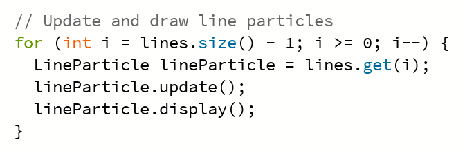
Adding the visualisation of leaking wealth.
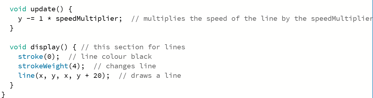
Speed multiplier of the expansion of the circle and lines.
Artist's Statement
I designed a GIF that aims to communicate the widening wealth inequality gap in New Zealand. According to the Guardian, “New Zealand’s wealthiest 10% owns nearly 60% of all assets”. I wanted to communicate this statistic through the parameters of the assignment by using simple, geometric shapes.
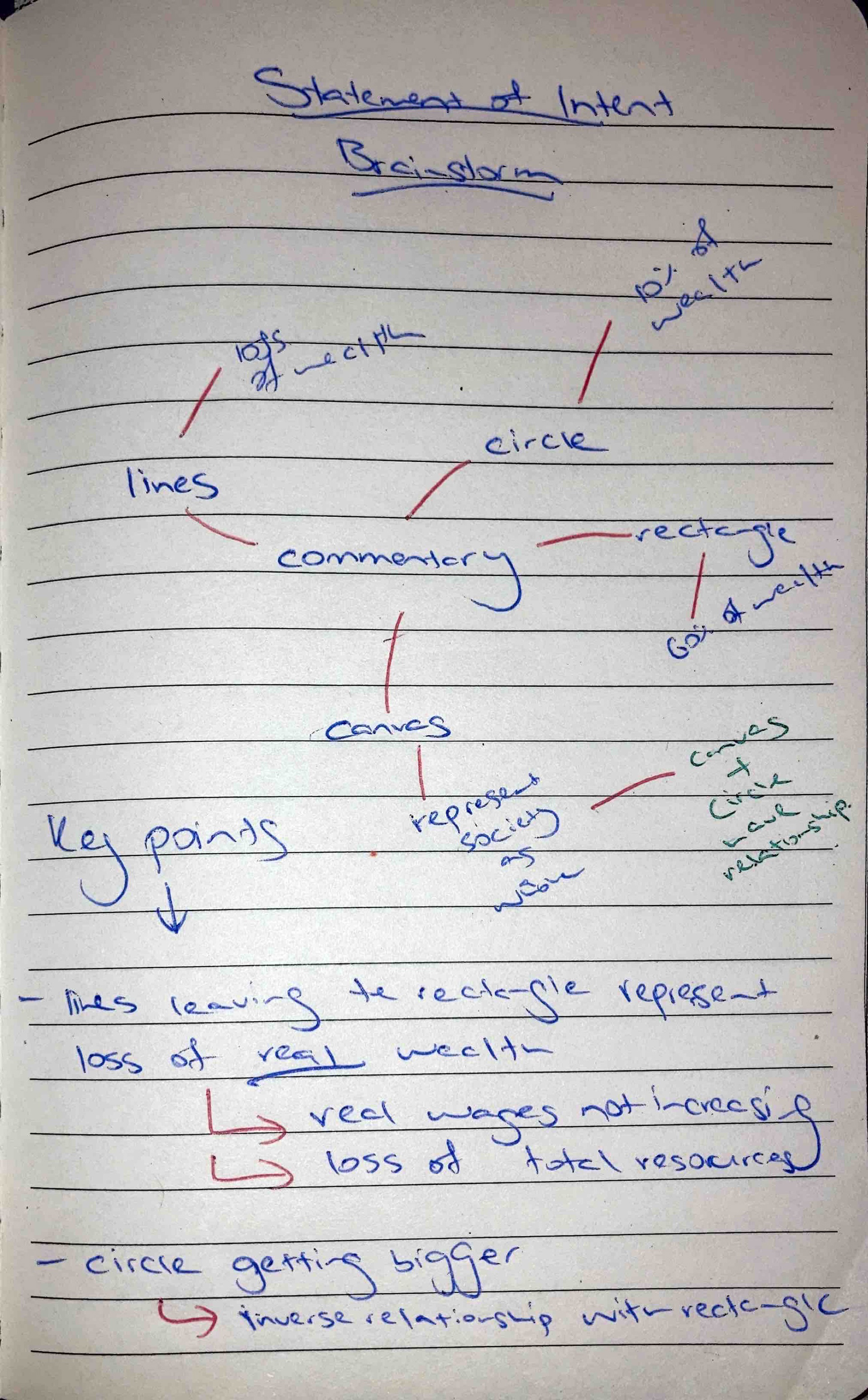
The GIF presents four main attributes: the 1000x1000 canvas, a diminishing rectangle, an expanding black hole and lines emitting from the rectangle. Each attribute communicates an aspect of New Zealand society that has been effected by the widening wealth gap.
The GIF begins with a small circle (representing the 10% of NZ) and a rectangle that represents 40% of the rest of New Zealand’s assets, with the circle controlling the 60%. As the GIF progresses, the circle expands whilst the rectangle gets smaller, emitting small lines representing the loss of wealth over time. These lines may be seen as the gradual and slow loss of “real” wealth, with wages not being able to keep up with inflation.
The final stages of the GIF show the circle expanding, completely swallowing the rectangle and almost engulfing the entire canvas. I wanted to incorporate this to show the possible futures New Zealand may face with a widening wealth gap.